

The basic and most important part of the Machine learning and Data analysis is to understand the Data, Analyze the pattern in technical way we will say distribution of the data, we will discuss as follow:
To understand the machine learning and data science perfectly you must know the statistics. we are going to discuss most important techniques in the Statistics.
Types of Statistics:
- Descriptive
- Inferential
Descriptive Statistics:
1) Measure of Central Tendencies (Mean, Median, Mode)
Measures of central tendency are statistical metrics that summarize a dataset by identifying its central point. They provide insights into the “typical” or “average” value in a dataset, making them essential for analyzing and comparing data distributions.
There are three main measures of central tendency: Mean, Median, and Mode.
1. Mean (Arithmetic Average)
The mean is the sum of all values in a dataset divided by the number of values. It is the most commonly used measure of central tendency.
Formula
For a dataset with nnn values: Mean(xˉ)=∑xin\text{Mean} (\bar{x}) = \frac{\sum x_i}{n}Mean(xˉ)=n∑xi
where:
- xix_ixi represents individual values,
- nnn is the total number of values.
Example
Consider the dataset: {4, 8, 10, 12, 14} xˉ=4+8+10+12+145=485=9.6\bar{x} = \frac{4 + 8 + 10 + 12 + 14}{5} = \frac{48}{5} = 9.6xˉ=54+8+10+12+14=548=9.6
Thus, the mean is 9.6.
Pros and Cons
✅ Easy to calculate and widely used.
✅ Considers all values in the dataset.
❌ Sensitive to outliers (e.g., extreme values can skew the mean).
2. Median (Middle Value of a Sorted Dataset)
The median is the middle value when the dataset is arranged in ascending or descending order. If there are an odd number of values, the median is the middle one. If there are an even number of values, the median is the average of the two middle values.
Steps to Find the Median
- Sort the dataset in ascending order.
- If nnn is odd, the median is the middle value: Median=x(n+12)\text{Median} = x_{\left(\frac{n+1}{2}\right)}Median=x(2n+1)
- If nnn is even, the median is the average of the two middle values: Median=x(n2)+x(n2+1)2\text{Median} = \frac{x_{\left(\frac{n}{2}\right)} + x_{\left(\frac{n}{2} + 1\right)}}{2}Median=2x(2n)+x(2n+1)
Example 1 (Odd Number of Values)
Dataset: {3, 7, 9, 11, 15}
- Middle value: 9 (third value in sorted order).
- Median = 9
Example 2 (Even Number of Values)
Dataset: {2, 5, 8, 12, 14, 18}
- Middle two values: 8 and 12
- Median: 8+122=10\frac{8 + 12}{2} = 1028+12=10
- Median = 10
Pros and Cons
✅ Not affected by outliers, making it a good measure for skewed distributions.
✅ Works well for ordinal data.
❌ Ignores extreme values in the dataset.
3. Mode (Most Frequent Value)
The mode is the value that appears most frequently in a dataset. A dataset can have:
- No mode (if all values appear once).
- One mode (Unimodal dataset).
- Two modes (Bimodal dataset).
- More than two modes (Multimodal dataset).
Example 1 (Unimodal Dataset)
Dataset: {2, 4, 4, 6, 8, 10}
- The number 4 appears twice, making it the mode.
- Mode = 4
Example 2 (Bimodal Dataset)
Dataset: {1, 3, 3, 5, 7, 7, 9}
- Two numbers appear most frequently: 3 and 7.
- Modes = 3 and 7 (Bimodal)
Example 3 (No Mode)
Dataset: {2, 5, 8, 11, 14}
- No repeated values, so no mode exists.
Pros and Cons
✅ Useful for categorical data (e.g., finding the most common brand, product, or category).
✅ Works well for non-numeric data.
❌ May not exist or may be multiple, making interpretation difficult.
Choosing the Best Measure of Central Tendency
| Scenario | Best Measure |
|---|---|
| Symmetric data with no outliers | Mean |
| Skewed data with outliers | Median |
| Categorical or qualitative data | Mode |
| Bimodal/multimodal distribution | Mode |
Example: House Prices
Consider the house prices (in $1000s):
{120, 130, 135, 140, 500}
- Mean = 120+130+135+140+5005=205\frac{120+130+135+140+500}{5} = 2055120+130+135+140+500=205 (highly affected by outlier).
- Median = 135 (middle value, better representation).
- Mode = No mode (no repetition).
In this case, the median is the best measure because it is unaffected by the extreme value (500).
2) Measure of Dispersion (Standard Deviation, Variance)
1. Measures of Dispersion
While measures of central tendency (mean, median, mode) tell us about the center of the data, measures of dispersion describe how spread out the data points are. The most common measures of dispersion include Variance and Standard Deviation.
1.1 Variance (𝜎² or s²)
Variance measures how much each data point deviates from the mean, squared.
Formulas for Variance
- Population Variance (𝜎²) σ2=∑(xi−μ)2N\sigma^2 = \frac{\sum (x_i – \mu)^2}{N}σ2=N∑(xi−μ)2 where:
- σ2\sigma^2σ2 = population variance
- xix_ixi = individual data points
- μ\muμ = population mean
- NNN = total number of data points in the population
- Sample Variance (s²) s2=∑(xi−xˉ)2n−1s^2 = \frac{\sum (x_i – \bar{x})^2}{n – 1}s2=n−1∑(xi−xˉ)2 where:
- s2s^2s2 = sample variance
- xˉ\bar{x}xˉ = sample mean
- nnn = sample size
🔹 Why use (n-1) in the sample variance formula?
The denominator (n−1)(n-1)(n−1) is known as Bessel’s correction, which corrects for bias in estimating the population variance from a sample.
1.2 Standard Deviation (𝜎 or s)
Standard deviation is simply the square root of variance. It provides a measure of spread in the same units as the data.
Formulas for Standard Deviation
- Population Standard Deviation σ=∑(xi−μ)2N\sigma = \sqrt{\frac{\sum (x_i – \mu)^2}{N}}σ=N∑(xi−μ)2
- Sample Standard Deviation s=∑(xi−xˉ)2n−1s = \sqrt{\frac{\sum (x_i – \bar{x})^2}{n – 1}}s=n−1∑(xi−xˉ)2
Example Calculation: Consider the dataset {10, 12, 14, 18, 20}
- Find the mean: xˉ=10+12+14+18+205=14.8\bar{x} = \frac{10+12+14+18+20}{5} = 14.8xˉ=510+12+14+18+20=14.8
- Calculate squared deviations from the mean: (10−14.8)2=23.04,(12−14.8)2=7.84,(14−14.8)2=0.64(10 – 14.8)^2 = 23.04, \quad (12 – 14.8)^2 = 7.84, \quad (14 – 14.8)^2 = 0.64(10−14.8)2=23.04,(12−14.8)2=7.84,(14−14.8)2=0.64 (18−14.8)2=10.24,(20−14.8)2=27.04(18 – 14.8)^2 = 10.24, \quad (20 – 14.8)^2 = 27.04(18−14.8)2=10.24,(20−14.8)2=27.04
- Find Variance: s2=23.04+7.84+0.64+10.24+27.045−1=68.84=17.2s^2 = \frac{23.04 + 7.84 + 0.64 + 10.24 + 27.04}{5 – 1} = \frac{68.8}{4} = 17.2s2=5−123.04+7.84+0.64+10.24+27.04=468.8=17.2
- Find Standard Deviation: s=17.2≈4.15s = \sqrt{17.2} \approx 4.15s=17.2≈4.15
Thus, the sample standard deviation is 4.15.
2. Population vs. Sample
2.1 Population
A population includes all members of a defined group. When we calculate statistics for an entire population, we use N in the denominator.
Example: The average height of all people in a country.
2.2 Sample
A sample is a subset of a population. Since we usually cannot collect data from the entire population, we estimate statistics using a sample and use n-1 in the denominator.
Example: Measuring the height of 1,000 randomly selected people to estimate the national average.
3. Types of Variables
Variables are classified into categorical and numerical types.
3.1 Categorical Variables (Qualitative)
Categorical variables represent distinct groups or categories.
- Nominal: No order or ranking. (e.g., Colors: {Red, Blue, Green})
- Ordinal: Categories have a meaningful order. (e.g., Education level: {High School, Bachelor’s, Master’s})
3.2 Numerical Variables (Quantitative)
Numerical variables represent measurable quantities.
- Discrete: Can take only specific values, usually integers. (e.g., Number of children: {0, 1, 2, 3})
- Continuous: Can take any value within a range. (e.g., Height: {5.4 ft, 5.5 ft, 6.2 ft})
4. Data Visualization: Histograms and KDE
4.1 Histograms
A histogram is a graphical representation of the frequency distribution of numerical data. It consists of bins, where each bin represents a range of values, and the height of the bar represents the frequency.
🔹 Example of a Histogram:
- If we have test scores {50, 55, 60, 60, 65, 70, 75, 80, 85, 90}, a histogram would show how often scores fall within certain ranges (bins like 50-60, 60-70, etc.).
🔹 Advantages of Histograms: ✅ Shows the distribution of data
✅ Helps detect skewness and outliers
4.2 Kernel Density Estimation (KDE)
A Kernel Density Estimate (KDE) is a smoothed version of a histogram. Instead of using bars, KDE uses a smooth curve to estimate the probability density function of a dataset.
🔹 Why Use KDE?
- Unlike histograms, KDE does not depend on bin width, providing a clearer view of data distribution.
🔹 Example: If we have a dataset of student heights, a KDE plot would give a smooth curve that helps visualize the probability density of different height ranges.
🔹 Difference Between Histogram & KDE
| Feature | Histogram | KDE |
|---|---|---|
| Representation | Binned Bars | Smooth Curve |
| Sensitivity | Depends on bin width | Depends on kernel bandwidth |
| Use Case | Discrete counts | Probability density estimation |
Understanding Percentiles, Quartiles & the 5-Number Summary
The Foundation of Exploratory Data Analysis (EDA)
When you’re trying to understand a dataset or detect outliers, few tools are more powerful and intuitive than percentiles, quartiles, and the 5-number summary. These help you explore how your data is distributed and identify extreme values with precision.
🔢 1. Percentiles
Percentiles divide the dataset into 100 equal parts. Each percentile tells you the value below which a certain percentage of data falls.
Example:
- 25th percentile (P25) → 25% of data lies below this value.
- 90th percentile (P90) → 90% of data lies below this value.
Percentiles help describe the relative standing of a value in the dataset.
🧮 2. Quartiles
Quartiles are specific percentiles that divide your data into four equal parts.
| Quartile | Percentile Equivalent | Meaning |
|---|---|---|
| Q1 (1st Quartile) | 25th Percentile | 25% of data below |
| Q2 (Median) | 50th Percentile | Middle value |
| Q3 (3rd Quartile) | 75th Percentile | 75% of data below |
🧰 3. The 5-Number Summary
The 5-number summary is one of the most important techniques in descriptive statistics. It gives a quick overview of the distribution of your data and is crucial for visualizations like box plots.
✅ It includes:
- Minimum – Smallest value in the dataset
- Q1 (1st Quartile) – 25% of data lies below this
- Median (Q2) – 50% of data lies below this
- Q3 (3rd Quartile) – 75% of data lies below this
- Maximum – Largest value in the dataset
📐 4. Interquartile Range (IQR)
The Interquartile Range (IQR) measures the spread of the middle 50% of the data. IQR=Q3−Q1
This is a robust measure of variability that is not affected by outliers.
🚨 5. Detecting Outliers using IQR
The IQR can be used to create fences beyond which data points are considered outliers.
🔻 Lower Fence:
Lower Fence=Q1−1.5×IQR
🔺 Upper Fence:
Upper Fence=Q3+1.5×IQR
Any value below the lower fence or above the upper fence is typically classified as an outlier.
📊 6. Example: 5-Number Summary + IQR Calculation
📘 Dataset:
data = [7, 8, 8, 10, 12, 13, 14, 15, 16, 22, 40]
🔍 Step-by-Step:
- Minimum = 7
- Maximum = 40
- Median (Q2) = 13
- Q1 (25th percentile) = 9
- Q3 (75th percentile) = 16
So the 5-number summary is:
[Minimum = 7, Q1 = 9, Median = 13, Q3 = 16, Maximum = 40]
📏 Calculate IQR:
IQR=Q3−Q1=16−9=7
🔎 Determine fences:
- Lower Fence = 9−(1.5×7)=9−10.5=−1.59 – (1.5 \times 7) = 9 – 10.5 = -1.59−(1.5×7)=9−10.5=−1.5
- Upper Fence = 16+(1.5×7)=16+10.5=26.516 + (1.5 \times 7) = 16 + 10.5 = 26.516+(1.5×7)=16+10.5=26.5
🧨 Outlier Detection:
Any value > 26.5 or < -1.5 is an outlier.
✅ So, in this dataset, 40 is an outlier.
📦 7. Visual Representation: Box Plot
The 5-number summary is used in box plots to visually summarize data.
- The box spans from Q1 to Q3
- A line marks the median (Q2)
- “Whiskers” extend to the smallest/largest non-outlier values
- Outliers are shown as dots or stars beyond the whiskers
🌟 Why Is This Important?
| Feature | Reason |
|---|---|
| Exploratory Data Analysis (EDA) | Quickly understand the spread and central tendency |
| Outlier Detection | IQR-based fences help detect anomalies |
| Feature Scaling & Normalization | Useful for feature engineering |
| Robust Statistics | Median and IQR are unaffected by extreme values, unlike mean & standard deviation |
📌 Summary Table
| Term | Description | Formula |
|---|---|---|
| Q1 | 25th percentile | – |
| Q2 (Median) | 50th percentile | – |
| Q3 | 75th percentile | – |
| IQR | Interquartile range | Q3−Q1Q3 – Q1Q3−Q1 |
| Lower Fence | Threshold for low outliers | Q1−1.5×IQR |
| Upper Fence | Threshold for high outliers | Q3+1.5×IQR |
| Outliers | Values outside fences | x<LF or x> UF x < LF |
Correlation and Covariance: A Comprehensive Guide
Covariance and correlation are fundamental statistical concepts used to measure the relationship between variables. While they serve similar purposes, they differ in important ways. Let’s explore both concepts in depth.
Covariance
Covariance measures how two variables change together. It indicates the direction of the linear relationship between variables.
Mathematical Definition
The sample covariance formula is:
Cov(X,Y) = Σ[(x_i – x̄)(y_i – ȳ)] / (n-1)
Where:
- x_i and y_i are individual data points
- x̄ and ȳ are the means of X and Y
- n is the number of data pairs
Interpretation
- Positive covariance: Variables tend to move in the same direction
- Negative covariance: Variables tend to move in opposite directions
- Zero covariance: No linear relationship between variables
Example
Let’s consider stock prices for two companies, A and B, over 5 days:
Day | Company A | Company B —-|———–|———- 1 | $10 | $5 2 | $12 | $6 3 | $11 | $4 4 | $13 | $7 5 | $14 | $8Step 1: Calculate means
- Mean of A = (10+12+11+13+14)/5 = $12
- Mean of B = (5+6+4+7+8)/5 = $6
Step 2: Calculate deviations and their products
Day | A-Mean(A) | B-Mean(B) | Product —-|———–|———–|——– 1 | -2 | -1 | 2 2 | 0 | 0 | 0 3 | -1 | -2 | 2 4 | 1 | 1 | 1 5 | 2 | 2 | 4Step 3: Sum products and divide by (n-1) Cov(A,B) = (2+0+2+1+4)/(5-1) = 9/4 = 2.25
The positive covariance indicates that when stock A increases, stock B tends to increase as well.
Types of Covariance
1. Positive Covariance
Indicates that variables tend to move in the same direction.
Example: Height and weight in humans typically have positive covariance because taller people generally weigh more than shorter people.
2. Negative Covariance
Indicates that variables tend to move in opposite directions.
Example: Hours spent studying and number of errors on a test typically have negative covariance because more study time usually results in fewer errors.
3. Zero Covariance
Indicates no linear relationship between variables.
Example: Shoe size and intelligence would likely have zero covariance because there’s no reason one would affect the other.
4. Autocovariance
Measures the covariance of a variable with itself at different time points.
Example: In time series analysis, the price of gold today might have a high autocovariance with its price yesterday.
5. Cross-covariance
Measures the similarity between two different time series at different time lags.
Example: Rainfall amounts and reservoir levels might show cross-covariance with a lag, as it takes time for rainfall to affect reservoir levels.
Correlation
Correlation is a standardized version of covariance that measures both the strength and direction of a linear relationship between variables. It always falls between -1 and 1.
Mathematical Definition
The Pearson correlation coefficient is:
ρ(X,Y) = Cov(X,Y) / (σ_X × σ_Y)
Where:
- Cov(X,Y) is the covariance
- σ_X is the standard deviation of X
- σ_Y is the standard deviation of Y
Interpretation
- Correlation of 1: Perfect positive correlation
- Correlation of -1: Perfect negative correlation
- Correlation of 0: No linear correlation
- Correlation between 0 and 1: Positive correlation
- Correlation between -1 and 0: Negative correlation
Example
Continuing with our stock price example:
Step 1: Calculate standard deviations
- For Company A: σ_A = sqrt([((-2)² + 0² + (-1)² + 1² + 2²)/5]) = sqrt(10/5) = sqrt(2) ≈ 1.41
- For Company B: σ_B = sqrt([((-1)² + 0² + (-2)² + 1² + 2²)/5]) = sqrt(10/5) = sqrt(2) ≈ 1.41
Step 2: Calculate correlation
- ρ(A,B) = Cov(A,B) / (σ_A × σ_B) = 2.25 / (1.41 × 1.41) = 2.25/2 = 1.125
(Note: In practice, correlation should always be between -1 and 1. The slight discrepancy here is due to rounding. The actual correlation would be 1, indicating perfect positive correlation.)
Types of Correlation
1. Pearson Correlation
Measures linear relationships between variables with continuous, normally distributed data.
Example: The relationship between height and weight typically follows a linear pattern suitable for Pearson correlation.
2. Spearman Rank Correlation
Measures monotonic relationships, where variables tend to change together but not necessarily at a constant rate.
Example: The relationship between age and reading ability in children might be monotonic (generally increasing) but not strictly linear.
Pearson Correlation Coefficient and Spearman Rank Correlation Coefficient
Let me explain both correlation methods in detail, including their formulas, interpretations, and when to use each one.
Pearson Correlation Coefficient
The Pearson correlation coefficient (r) measures the linear relationship between two continuous variables. It’s the most commonly used correlation measure in statistics.
Formula
For two variables X and Y with n observations, the Pearson correlation coefficient is calculated as:
r = Σ[(xᵢ – x̄)(yᵢ – ȳ)] / √[Σ(xᵢ – x̄)² × Σ(yᵢ – ȳ)²]
Alternatively, it can be expressed as:
r = Cov(X,Y) / (σₓ × σᵧ)
Where:
- xᵢ and yᵢ are individual data points
- x̄ and ȳ are the means of X and Y
- Cov(X,Y) is the covariance between X and Y
- σₓ and σᵧ are the standard deviations of X and Y
Properties
- Range: Always between -1 and +1
- Interpretation:
- r = 1: Perfect positive linear relationship
- r = -1: Perfect negative linear relationship
- r = 0: No linear relationship
- 0 < |r| < 0.3: Weak correlation
- 0.3 ≤ |r| < 0.7: Moderate correlation
- 0.7 ≤ |r| < 1: Strong correlation
- Symmetry: r(X,Y) = r(Y,X)
- Invariance to linear transformations: If Y = aX + b (where a > 0), then r = 1
Example Calculation
Consider these data points:
CopyX: 1, 2, 3, 4, 5
Y: 2, 3, 5, 7, 11
Step 1: Calculate means
- x̄ = (1+2+3+4+5)/5 = 3
- ȳ = (2+3+5+7+11)/5 = 5.6
Step 2: Calculate deviations, squares, and products
X | Y | X-x̄ | Y-ȳ | (X-x̄)² | (Y-ȳ)² | (X-x̄)(Y-ȳ) —–|—–|—–|—–|———|———|———— 1 | 2 | -2 | -3.6| 4 | 12.96 | 7.2 2 | 3 | -1 | -2.6| 1 | 6.76 | 2.6 3 | 5 | 0 | -0.6| 0 | 0.36 | 0 4 | 7 | 1 | 1.4| 1 | 1.96 | 1.4 5 | 11 | 2 | 5.4| 4 | 29.16 | 10.8 —–|—–|—–|—–|———|———|———— Sum: | | | | 10 | 51.2 | 22.0Step 3: Calculate r r = 22.0 / √(10 × 51.2) = 22.0 / √512 = 22.0 / 22.63 ≈ 0.972
This indicates a very strong positive linear relationship between X and Y.
Assumptions and Limitations
- Assumes variables have a linear relationship
- Sensitive to outliers
- Both variables should be normally distributed for hypothesis testing
- Measures only linear relationships
Spearman Rank Correlation Coefficient
The Spearman rank correlation coefficient (ρ or rₛ) measures the monotonic relationship between two variables by using their ranks rather than actual values.
Formula
For two variables X and Y with n observations, the Spearman correlation is calculated as:
ρ = 1 – (6 × Σd²) / (n(n² – 1))
Where:
- d is the difference between the ranks of corresponding values of X and Y
- n is the number of observations
If there are no tied ranks, this simplifies to:
ρ = Pearson correlation coefficient between the ranks of X and Y
Properties
- Range: Always between -1 and +1
- Interpretation:
- ρ = 1: Perfect monotonic increasing relationship
- ρ = -1: Perfect monotonic decreasing relationship
- ρ = 0: No monotonic relationship
- Similar magnitude interpretation as Pearson (weak, moderate, strong)
- Invariant to any monotonic transformation of the variables
- Less sensitive to outliers than Pearson
Example Calculation
Consider these data points:
X: 5, 10, 15, 20, 25
Y: 2, 4, 5, 9, 12
Step 1: Rank the values in each variable (1 = lowest, n = highest)
X | Y | Rank X | Rank Y | d (difference) | d² —–|—–|——–|——–|—————-|—– 5 | 2 | 1 | 1 | 0 | 0 10 | 4 | 2 | 2 | 0 | 0 15 | 5 | 3 | 3 | 0 | 0 20 | 9 | 4 | 4 | 0 | 0 25 | 12 | 5 | 5 | 0 | 0 —–|—–|——–|——–|—————-|—– Σd² = 0Step 2: Calculate ρ ρ = 1 – (6 × 0) / (5(5² – 1)) = 1 – 0/120 = 1
This indicates a perfect monotonic relationship between X and Y.
Handling Tied Ranks
When ties occur, each tied value is assigned the average of the ranks they would have received if they were distinct. For example, if the 2nd and 3rd positions are tied, both receive rank 2.5.
For tied ranks, the formula can be adjusted to:
ρ = (Σ(xᵢ – x̄)(yᵢ – ȳ)) / √(Σ(xᵢ – x̄)² × Σ(yᵢ – ȳ)²)
Where xᵢ and yᵢ are now the ranks.
Assumptions and Limitations
- Only assumes variables have a monotonic relationship (not necessarily linear)
- Less powerful than Pearson when data is truly linear and normally distributed
- Computationally more intensive for large datasets
When to Use Each Coefficient
Use Pearson When:
- Data is continuous
- The relationship appears linear
- Both variables are approximately normally distributed
- Outliers are minimal or have been addressed
- You need to measure the strength of strictly linear relationships
Use Spearman When:
- Data is ordinal or ranked
- The relationship appears monotonic but not necessarily linear
- Variables are not normally distributed
- Outliers are present
- You want to capture any monotonic relationship, not just linear ones
- You’re analyzing variables where exact values are less important than relative ordering
Practical Examples
- Pearson Correlation: Relationship between height and weight in a population (typically linear)
- Spearman Correlation: Relationship between customer satisfaction ratings (1-5 scale) and likelihood to repurchase (where the relationship might be monotonic but not strictly linear)
Key Differences Between Covariance and Correlation
- Scale: Covariance is affected by the scale of the variables; correlation is standardized between -1 and 1.
- Units: Covariance has units (product of the units of the two variables); correlation is unitless.
- Comparability: Correlations can be compared across different datasets; covariances generally cannot.
- Interpretation: Correlation provides both direction and strength; covariance only reliably indicates direction.
Applications in Data Analysis
Portfolio Management
- Positive covariance between assets increases portfolio risk
- Negative covariance helps diversify risk
Machine Learning
- Correlation analysis helps identify relevant features
- Principal Component Analysis uses covariance matrices to reduce dimensionality
Quality Control
- Correlation between process variables helps identify root causes of defects
Economic Analysis
- Correlation between GDP and unemployment rate helps understand economic cycles
Probability Distribution
The Relationship Between PDF, PMF, and CDF
Probability Mass Function (PMF)
The PMF applies to discrete random variables and gives the probability that a random variable X equals a specific value x.
Mathematical Definition: P(X = x) = PMF(x)
Properties:
- Non-negative: PMF(x) ≥ 0 for all x
- Sum to 1: Σ PMF(x) = 1 (over all possible values)
- Range: 0 ≤ PMF(x) ≤ 1
Example: For a fair six-sided die, the PMF is:
- P(X = 1) = P(X = 2) = … = P(X = 6) = 1/6
Probability Density Function (PDF)
The PDF applies to continuous random variables and represents the relative likelihood of the random variable taking on a specific value.
Mathematical Definition: f(x) = dF(x)/dx, where F(x) is the CDF
Properties:
- Non-negative: f(x) ≥ 0 for all x
- Area equals 1: ∫f(x)dx = 1 (integrated over all possible values)
- P(a ≤ X ≤ b) = ∫(from a to b) f(x)dx
- Unlike PMF, PDF can exceed 1 at specific points
Example: The PDF of a standard normal distribution is: f(x) = (1/√(2π)) * e^(-x²/2)
Cumulative Distribution Function (CDF)
The CDF applies to both discrete and continuous random variables and gives the probability that X is less than or equal to x.
Mathematical Definition: F(x) = P(X ≤ x)
For discrete variables: F(x) = Σ PMF(t) for all t ≤ x For continuous variables: F(x) = ∫(from -∞ to x) f(t)dt
Properties:
- Non-decreasing: F(x₁) ≤ F(x₂) if x₁ < x₂
- Limits: lim(x→-∞) F(x) = 0 and lim(x→∞) F(x) = 1
- Range: 0 ≤ F(x) ≤ 1
- P(a < X ≤ b) = F(b) – F(a)
Example: For a standard normal distribution, the CDF doesn’t have a simple closed form but is often denoted as Φ(x).
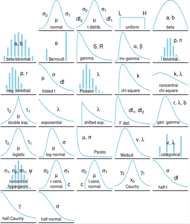
Types of Probability Distributions
Probability distributions come in two main categories:
Discrete Probability Distributions
- Bernoulli Distribution: Models binary outcomes (success/failure)
- Binomial Distribution: Sum of independent Bernoulli trials
- Poisson Distribution: Models rare events in fixed intervals
- Geometric Distribution: Number of trials until first success
- Negative Binomial: Number of trials until k successes
- Hypergeometric: Sampling without replacement
- Discrete Uniform: Equal probability for all outcomes
Continuous Probability Distributions
- Normal/Gaussian Distribution: Bell-shaped curve
- Standard Normal Distribution: Normal with μ=0, σ=1
- Uniform Distribution: Equal probability density over interval
- Exponential Distribution: Time between Poisson events
- Log-Normal Distribution: When logarithm follows normal distribution
- Chi-Square Distribution: Sum of squared standard normal variables
- Student’s t-Distribution: Used for small sample statistics
- F-Distribution: Ratio of chi-squared distributions
- Beta Distribution: Models probabilities or proportions
- Gamma Distribution: Generalizes exponential and chi-squared
- Weibull Distribution: Models failure rates and reliability
- Pareto Distribution: Power-law probability distribution
- Cauchy Distribution: Heavy-tailed distribution
Bernoulli Distribution
The Bernoulli distribution is the simplest discrete probability distribution, modeling a single binary outcome.
Properties
- PMF: P(X = x) = p^x × (1-p)^(1-x) for x ∈ {0, 1}
- Mean: E[X] = p
- Variance: Var(X) = p(1-p)
- Parameter: p = probability of success (0 ≤ p ≤ 1)
Example
Flipping a coin once with p = 0.5 probability of heads:
- P(X = 1) = 0.5 (heads)
- P(X = 0) = 0.5 (tails)
Bernoulli Distribution
Image
Applications
- Quality control (defective/non-defective)
- Medical tests (positive/negative)
- Elections (win/lose)
- Any yes/no, success/failure scenario
Binomial Distribution
The binomial distribution models the number of successes in a fixed number of independent Bernoulli trials.
Properties
- PMF: P(X = k) = (n choose k) × p^k × (1-p)^(n-k)
- Mean: E[X] = np
- Variance: Var(X) = np(1-p)
- Parameters:
- n = number of trials
- p = probability of success on each trial
Example
Flipping a fair coin 10 times and counting heads:
- n = 10, p = 0.5
- P(X = 5) = (10 choose 5) × 0.5^5 × 0.5^5 = 252 × 0.001953 = 0.246
Binomial Distribution
Image
Applications
- Quality control (number of defects in a batch)
- Medical studies (number of patients recovering)
- Sports statistics (number of successful shots)
- Election polling (number of voters supporting a candidate)
Poisson Distribution
The Poisson distribution models the number of events occurring in a fixed interval of time or space, when these events happen at a constant average rate.
Properties
- PMF: P(X = k) = (e^(-λ) × λ^k) / k!
- Mean: E[X] = λ
- Variance: Var(X) = λ
- Parameter: λ = average number of events per interval
Example
If emails arrive at an average rate of 5 per hour:
- λ = 5
- P(X = 3) = (e^(-5) × 5^3) / 3! = (0.0067 × 125) / 6 = 0.140
Poisson Distribution
Image
Applications
- Customer arrivals at a service counter
- Number of calls to a call center
- Number of defects in manufacturing
- Number of accidents at an intersection
- Radioactive decay events
Normal/Gaussian Distribution
The normal distribution is the most important continuous probability distribution, characterized by its bell-shaped curve.
Properties
- PDF: f(x) = (1/(σ√(2π))) × e^(-(x-μ)²/(2σ²))
- Mean: E[X] = μ
- Variance: Var(X) = σ²
- Parameters:
- μ = mean (location parameter)
- σ = standard deviation (scale parameter)
Example
Human heights often follow a normal distribution. If adult male heights have μ = 175 cm and σ = 7 cm:
- 68% of men have heights between 168-182 cm (μ ± σ)
- 95% of men have heights between 161-189 cm (μ ± 2σ)
- 99.7% of men have heights between 154-196 cm (μ ± 3σ)