
I specialize in the dynamic and ever-evolving field of Artificial Intelligence, Data Science. My expertise lies in harnessing the power of AI, Natural Language Processing (NLP), Data Engineering, and cutting-edge AI-ML technologies to unravel complex problems and unlock new possibilities.
Projects Category: webapp
- Home
- webapp
In an era where environmental concerns increasingly shape public policy and personal health decisions, access to real-time air quality data has never been more crucial. The AQI Google Maps project represents an innovative approach to environmental monitoring, combining Google Maps’ familiar interface with critical air quality metrics. This open-source initiative transforms complex environmental data into an accessible visualization tool that can benefit researchers, policymakers, and everyday citizens concerned about the air they breathe.
What is the AQI Google Maps Project?
The AQI (Air Quality Index) Google Maps project is an open-source web application that integrates air quality data with Google Maps to provide a visual representation of air pollution levels across different locations. Developed by Tejas K (GitHub: tejask0512), this project leverages modern web technologies and public APIs to create an interactive map where users can view air quality conditions with intuitive color-coded markers.
Technical Architecture
The project employs a straightforward yet effective technical stack:
- Frontend: HTML, CSS, JavaScript
- APIs: Google Maps API for mapping functionality, Air Quality APIs for pollution data
- Data Visualization: Custom markers and color-coding system
The core functionality revolves around fetching air quality data based on geographic coordinates and rendering this information as color-coded markers on the Google Maps interface. The colors transition from green (good air quality) through yellow and orange to red and purple (hazardous air quality), providing an immediate visual understanding of conditions in different areas.
Deep Dive into AQI Analysis
Understanding the Air Quality Index
The Air Quality Index is a standardized indicator developed by environmental agencies to communicate how polluted the air is and what associated health effects might be. The AQI Google Maps project implements this complex calculation system and presents it in an accessible format.
The AQI typically accounts for multiple pollutants:
| Pollutant | Source | Health Impact |
|---|---|---|
| PM2.5 (Fine Particulate Matter) | Combustion engines, forest fires, industrial processes | Can penetrate deep into lungs and bloodstream |
| PM10 (Coarse Particulate Matter) | Dust, pollen, mold | Respiratory irritation, asthma exacerbation |
| O3 (Ozone) | Created by chemical reactions between NOx and VOCs | Lung damage, respiratory issues |
| NO2 (Nitrogen Dioxide) | Vehicles, power plants | Respiratory inflammation |
| SO2 (Sulfur Dioxide) | Fossil fuel combustion, industrial processes | Respiratory issues, contributes to acid rain |
| CO (Carbon Monoxide) | Incomplete combustion | Reduces oxygen delivery in bloodstream |
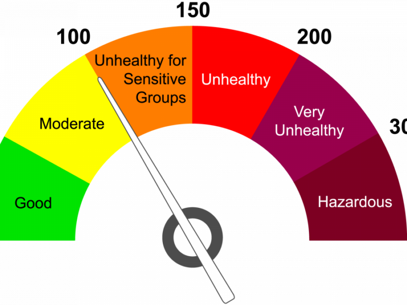
The project likely calculates an overall AQI based on the highest concentration of any single pollutant, following the EPA’s approach where:
- 0-50 (Green): Good air quality with minimal health concerns
- 51-100 (Yellow): Moderate air quality; unusually sensitive individuals may experience issues
- 101-150 (Orange): Unhealthy for sensitive groups
- 151-200 (Red): Unhealthy for all groups
- 201-300 (Purple): Very unhealthy; may trigger health alerts
- 301+ (Maroon): Hazardous; serious health effects for entire population
The technical implementation likely includes conversion formulas to normalize different pollutant measurements to the same 0-500 AQI scale.
Real-time Data Processing
A key technical achievement of the project is its ability to process real-time air quality data. This involves:
- API Integration: Connecting to air quality data providers through RESTful APIs
- Data Parsing: Extracting relevant metrics from JSON/XML responses
- Coordinate Mapping: Associating pollution data with precise geographic coordinates
- Temporal Synchronization: Managing data freshness and update frequencies
The project handles these operations seamlessly in the background, presenting users with up-to-date information without exposing the complexity of the underlying data acquisition process.
Report Generation Capabilities
One of the project’s valuable features is its ability to generate comprehensive air quality reports. These reports serve multiple purposes:
Types of Reports Generated
- Location-specific Snapshots: Detailed breakdowns of current air quality at selected points
- Comparative Analysis: Contrasting air quality across multiple locations
- Temporal Reports: Tracking air quality changes over time (hourly, daily, weekly)
- Pollutant-specific Reports: Focusing on individual contaminants like PM2.5 or O3
Report Components
The reporting system likely includes:
- Statistical Summaries: Min/max/mean values for AQI metrics
- Health Impact Assessments: Explanations of potential health effects based on current readings
- Visualizations: Charts and graphs depicting pollution trends
- Contextual Information: Weather conditions that may influence readings
- Actionable Recommendations: Suggested activities based on air quality levels
Technical Implementation of Reporting
From a development perspective, the reporting functionality demonstrates sophisticated data processing:
// Conceptual example of report generation logic
function generateAQIReport(locationData, timeframe) {
  const reportData = {
    location: locationData.name,
    coordinates: locationData.coordinates,
    timestamp: new Date(),
    metrics: {
      overall: calculateOverallAQI(locationData.pollutants),
      individual: locationData.pollutants,
      trends: analyzeTrends(locationData.history, timeframe)
    },
    healthImplications: assessHealthImpact(calculateOverallAQI(locationData.pollutants)),
    recommendations: generateRecommendations(calculateOverallAQI(locationData.pollutants))
  };

  return formatReport(reportData, preferredFormat);
}
This functionality transforms raw data into actionable intelligence, making the project valuable beyond simple visualization.
AQI and Location Coordinate Data for Machine Learning
Perhaps the most forward-looking aspect of the project is its potential for generating valuable datasets for machine learning applications. The combination of precise geolocation data with corresponding air quality metrics creates numerous possibilities for advanced environmental analysis.
Data Generation for ML Models
The project effectively creates a continuous stream of structured data points with these key attributes:
- Geographic Coordinates: Latitude and longitude
- Temporal Information: Timestamps for each measurement
- Multiple Pollutant Metrics: PM2.5, PM10, O3, NO2, SO2, CO values
- Calculated AQI: Overall air quality index
- Contextual Metadata: Potentially including weather conditions, urban density, etc.
This multi-dimensional dataset serves as excellent training data for various machine learning models.
Potential ML Applications
With sufficient data collection over time, the following machine learning approaches become possible:
1. Predictive Modeling
Machine learning algorithms can be trained to forecast air quality based on historical patterns:
- Time Series Forecasting: Using techniques like ARIMA, LSTM networks, or Prophet to predict AQI values hours or days in advance
- Multivariate Prediction: Incorporating weather forecasts, traffic patterns, and seasonal factors to improve accuracy
- Anomaly Detection: Identifying unusual pollution events that deviate from expected patterns
# Conceptual example of LSTM model for AQI prediction
from keras.models import Sequential
from keras.layers import LSTM, Dense

def build_aqi_prediction_model(lookback_window):
    model = Sequential()
    model.add(LSTM(50, activation='relu', input_shape=(lookback_window, n_features)))
    model.add(Dense(1))
    model.compile(optimizer='adam', loss='mse')
    return model

# Train with historical AQI data from project
model = build_aqi_prediction_model(24)  # 24-hour lookback window
model.fit(X_train, y_train, epochs=100, validation_split=0.2)
2. Spatial Analysis and Interpolation
The geospatial nature of the data enables sophisticated spatial modeling:
- Kriging/Gaussian Process Regression: Estimating pollution levels between measurement points
- Spatial Autocorrelation: Analyzing how pollution levels at one location influence nearby areas
- Hotspot Identification: Using clustering algorithms to detect persistent pollution sources
# Conceptual example of spatial interpolation
from sklearn.gaussian_process import GaussianProcessRegressor
from sklearn.gaussian_process.kernels import RBF, WhiteKernel

def interpolate_aqi_surface(known_points, known_values, grid_points):
    # Define kernel - distance matters for pollution spread
    kernel = RBF(length_scale=1.0) + WhiteKernel(noise_level=0.1)
    gpr = GaussianProcessRegressor(kernel=kernel)

    # Train on known AQI points
    gpr.fit(known_points, known_values)

    # Predict AQI at all grid points
    predicted_values = gpr.predict(grid_points)
    return predicted_values
3. Causal Analysis
Advanced machine learning techniques can help identify pollution drivers:
- Causal Inference Models: Determining the impact of traffic changes, industrial activities, or policy interventions on air quality
- Counterfactual Analysis: Estimating what air quality would be under different conditions
- Attribution Modeling: Quantifying the contribution of different sources to overall pollution levels
4. Computer Vision Integration
The project’s map-based approach opens possibilities for combining with visual data:
- Satellite Imagery Analysis: Correlating visible pollution (smog, industrial activity) with measured AQI
- Traffic Density Estimation: Using traffic camera feeds to predict localized pollution spikes
- Urban Development Impact: Analyzing how changes in urban landscapes affect air quality patterns
Implementation Considerations for ML Integration
To fully realize the machine learning potential, the project could implement:
- Data Export APIs: Programmatic access to historical AQI and coordinate data
- Standardized Dataset Generation: Creating properly formatted, cleaned datasets ready for ML models
- Feature Engineering Utilities: Tools to extract temporal patterns, spatial relationships, and other derived features
- Model Integration Endpoints: APIs that allow trained models to feed predictions back into the visualization system
// Conceptual implementation of data export for ML
function exportTrainingData(startDate, endDate, region, format='csv') {
  const dataPoints = fetchHistoricalData(startDate, endDate, region);

  // Process for ML readiness
  const mlReadyData = dataPoints.map(point => ({
    timestamp: point.timestamp,
    lat: point.coordinates.lat,
    lng: point.coordinates.lng,
    pm25: point.pollutants.pm25,
    pm10: point.pollutants.pm10,
    o3: point.pollutants.o3,
    no2: point.pollutants.no2,
    so2: point.pollutants.so2,
    co: point.pollutants.co,
    aqi: point.aqi,
    // Derived features
    hour_of_day: new Date(point.timestamp).getHours(),
    day_of_week: new Date(point.timestamp).getDay(),
    is_weekend: [0, 6].includes(new Date(point.timestamp).getDay()),
    season: calculateSeason(point.timestamp)
  }));

  return formatDataForExport(mlReadyData, format);
}
Key Features and Capabilities
The project demonstrates several notable features:
- Real-time air quality visualization: Displays current AQI values at selected locations
- Interactive map interface: Users can navigate, zoom, and click on markers to view detailed information
- Color-coded AQI indicators: Intuitive visual representation of pollution levels
- Customizable markers: Location-specific information about air quality conditions
- Responsive design: Functions across various device types and screen sizes
Environmental and Health Significance
The importance of this project extends far beyond its technical implementation. Here’s why such tools matter:
Public Health Impact
Air pollution is directly linked to numerous health problems, including respiratory diseases, cardiovascular issues, and even neurological disorders. According to the World Health Organization, air pollution causes approximately 7 million premature deaths annually worldwide. By making air quality data more accessible, this project empowers individuals to:
- Make informed decisions about outdoor activities
- Understand when to take protective measures (like wearing masks or staying indoors)
- Recognize patterns in local air quality that might affect their health
Environmental Awareness
Environmental literacy begins with awareness. When people can visually connect with environmental data, they’re more likely to:
- Understand the scope and severity of air pollution issues
- Recognize temporal and spatial patterns in air quality
- Connect human activities with environmental outcomes
- Support policies aimed at improving air quality
Research and Policy Applications
For researchers and policymakers, visualized air quality data offers valuable insights:
- Identifying pollution hotspots that require intervention
- Evaluating the effectiveness of environmental regulations
- Planning urban development with air quality considerations
- Allocating resources for environmental monitoring and mitigation
Case Study: Urban Planning and Environmental Justice
The AQI Google Maps project provides a powerful tool for addressing environmental justice concerns. By visualizing pollution patterns across different neighborhoods, it can reveal disparities in air quality that often correlate with socioeconomic factors.
Data-Driven Environmental Justice
Researchers can use the generated datasets to:
- Identify Disproportionate Impacts: Quantify differences in air quality across neighborhoods with varying income levels or racial demographics
- Temporal Justice Analysis: Determine if certain communities bear the burden of poor air quality during specific times (e.g., industrial activity hours)
- Policy Effectiveness: Measure how environmental regulations impact different communities
Practical Application Example
Consider a city planning department using the AQI Google Maps project to assess the impact of a proposed industrial development:
- Establish baseline air quality readings across all affected neighborhoods
- Use predictive modeling (with the ML techniques described above) to estimate pollution changes
- Generate reports showing projected AQI impacts on different communities
- Adjust development plans to minimize disproportionate impacts on vulnerable populations
This data-driven approach promotes equitable development and environmental protection.
The Future of Environmental Data Integration
The AQI Google Maps project represents an important step toward more integrated environmental monitoring. Future development could include:
Data Fusion Opportunities
- Cross-Pollutant Analysis: Investigating relationships between different pollutants
- Multi-Environmental Factor Integration: Combining air quality with noise pollution, water quality, and urban heat island effects
- Health Data Correlation: Connecting real-time AQI with emergency room visits for respiratory issues
Technical Evolution
- Edge Computing Integration: Processing air quality data from low-cost sensors at the edge
- Blockchain for Data Integrity: Ensuring the provenance and authenticity of environmental measurements
- Federated Learning: Enabling distributed model training across multiple air quality monitoring networks
Conclusion
The AQI Google Maps project represents an important intersection of environmental monitoring, data visualization, and public information. Its ability to generate structured air quality data associated with precise geographic coordinates creates a foundation for sophisticated analysis and machine learning applications.
By democratizing access to environmental data and creating opportunities for advanced computational analysis, this project contributes to both public awareness and scientific advancement. The potential for machine learning integration further elevates its significance, enabling predictive capabilities and deeper insights into pollution patterns.
As we continue to face environmental challenges, projects like this demonstrate how technology can be leveraged not just for convenience or entertainment, but for creating a more informed and environmentally conscious society. The combination of visual accessibility with data generation for machine learning represents a powerful approach to environmental monitoring that can drive both individual awareness and systemic change.
This blog post analyzes the AQI Google Maps project developed by Tejas K. The project is open-source and available for contributions on GitHub.